Let's look at some weird (and/or terrible) Concacaf logos!
Graphic design is the region's passion.
When I launched this newsletter a little more than a month ago, I said I wanted to tell stories that probably wouldn’t have gotten the green light from my editors at Goal for being too obscure. I’ve done that, talking to a player who left Nicaragua as the league plays on during the coronavirus pandemic - (Related: Scenes like this celebration in the streets after ART Jalapa kept its spot in the first division have quickly gone from thrilling to absolutely terrifying), chatting with a pair of former U.S. youth internationals about their uncertain future with the Ascenso MX in limbo and remembering the time I ended up in a Chinese restaurant/dive bar with Curacao’s finest marijuana salesman.
But sometimes the stuff I want to do just ain’t that serious. For the first time in what could be a recurring series (because there are a lot of these in the region): Let’s list some logos!
Parrillas One (Honduras)

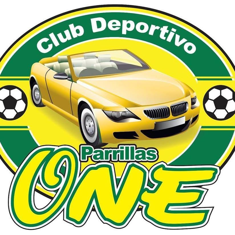
Though they lasted only a few seasons in the top division of Honduras, Parrillas One made a lasting impression. “The club represents Parrillas y Repuestos One, an automobile body shop,” Wikipedia reports. Could you tell?
The story of an auto-shop sponsored team turning professional and ending up in the first division is a great one. Their logo, well, maybe not so much. Although, they like it enough to put it on stadium renderings four times? I hope it looks exactly like this:
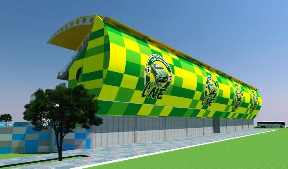
Also sometimes the totally-not-a-BMW is yellow! I love it.
Limon FC (Costa Rica)
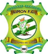
When you’re the “Tromba del Caribe” but aren’t sure how you can make sure people know that what do you do with your badge? You give that tromba arms and PUT IT ON THE BADGE!
San Jose Clash (MLS)

The first wave of Major League Soccer gave us some brightly tinted nostalgia and some really hideous logos, but for me this is the worst. If you wanted to be the Scorpions, why not actually name yourselves the Scorpions?
Joe Public (Trinidad and Tobago)

While the club may be gone, the strange letters used to render Joe (that O has got to be an olive, right?) and the lion in possession make sure that the Jack Warner-owned club will never be forgotten.
The Salvadoran Primera

Maybe there’s an allusion to some local art I’m missing, but without context, what is it?
Is it a bigger player taking a throw in over a smaller player who is also trying to take the throw in?
CD Dragón (El Salvador)
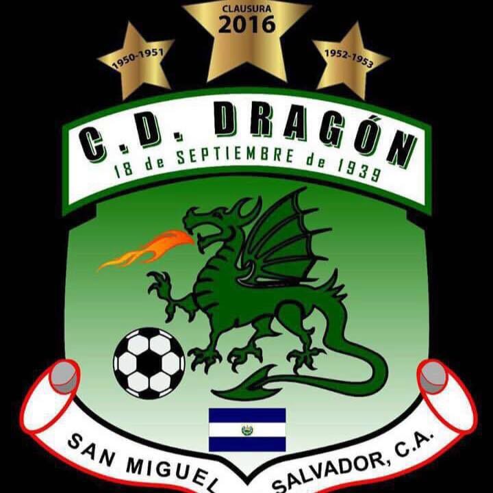
“We need a logo that shows we’re Dragón, we play soccer and we’re from El Salvador.”
Dragón rose to Concacaf nerd prominence during their 2016-17 Concacaf Champions League run in which they tweeted in all caps about the hospitality they were receiving in a very standard American hotel (A Howard Johnson?) and nobody could tell if it was earnest or ironic.
A.D. Chalatenango (El Salvador)
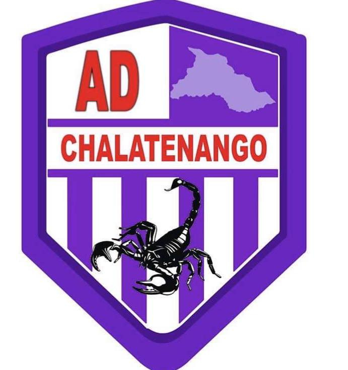
The logo for “El Duro del Norte” does go pretty hard, but there may be too much happening here. There’s the scorpion, the outline of the department, the stripes. It’s just a lot.
Palencia Assassins (Belize)
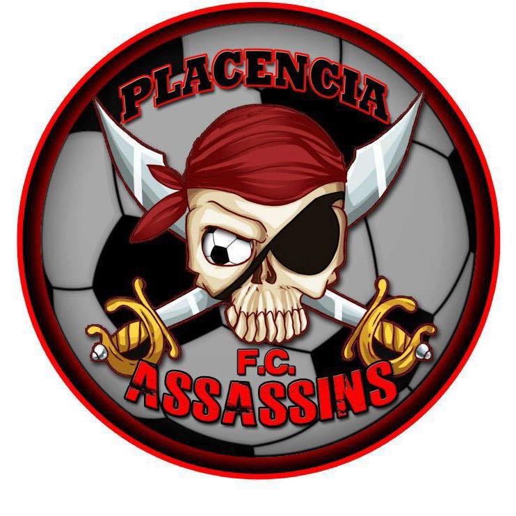
“This one is a bit much,” said Arch Bell, fellow Concacaf obsessive, when I asked him about a logo that stood out in his mind.
And, yeah, I guess it’s hard to be subtle when your team is named the Assassins. Also, not often you see two soccer balls worked into the logo in such different ways.
Morelia (Mexico)

Their current logo isn’t amazing either, but Morelia used this badge for nearly a full decade between 1973 and 1982. Map on the badge or guy with weirdly enormous forearm flexing? You decide.
Atletico San Francisco (Mexico)
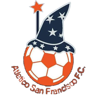
I love this logo, but not everyone is with me. Now in Mexico’s Serie B, the Brujos have regressed league-wise but progressed on the logo front.

It turns out Mexico’s Serie B is rich with outlandish logos. Do you prefer the Aguacateros de Uruapan’s current
or former logo?
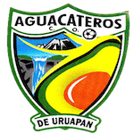
Give me the current design, but get those hands away from my avocado.
There’s also the Chapulineros de Oaxaca, whose current logo is fire:

but they had to suffer through this
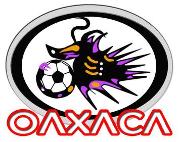
and this to get there:
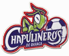
Let that be a lesson to all in this article. If your club’s logo stands out for the wrong reasons, there could always be a rebrand on the horizon.
Also, if I insulted the club you love, I apologize. Send me their jersey, I’ll wear it around the house during quarantine and we’ll call it even.


